The Psychology of Bedroom Colors: How Your Comforter Affects Your Mood and Sleep
Your bedroom should be a sanctuary where stress melts away and restful sleep comes naturally. But the colors surrounding you as you drift off and wake up have a profound impact on your mental state that goes far beyond simple aesthetics. Understanding color psychology can help you create a bedroom environment that actively supports relaxation, restoration, and emotional wellbeing.
Why Bedroom Color Matters More Than You Think
Your brain processes color automatically and unconsciously, triggering emotional and physiological responses before you're even aware of them. The colors in your bedroom influence your cortisol levels, heart rate, and even body temperature—all critical factors in sleep quality.
Unlike living spaces where you want energy and stimulation, your bedroom should promote calm and relaxation. The wrong colors can subtly increase stress and make it harder to mentally transition from the day's demands to nighttime rest.
The Calming Power of Neutrals
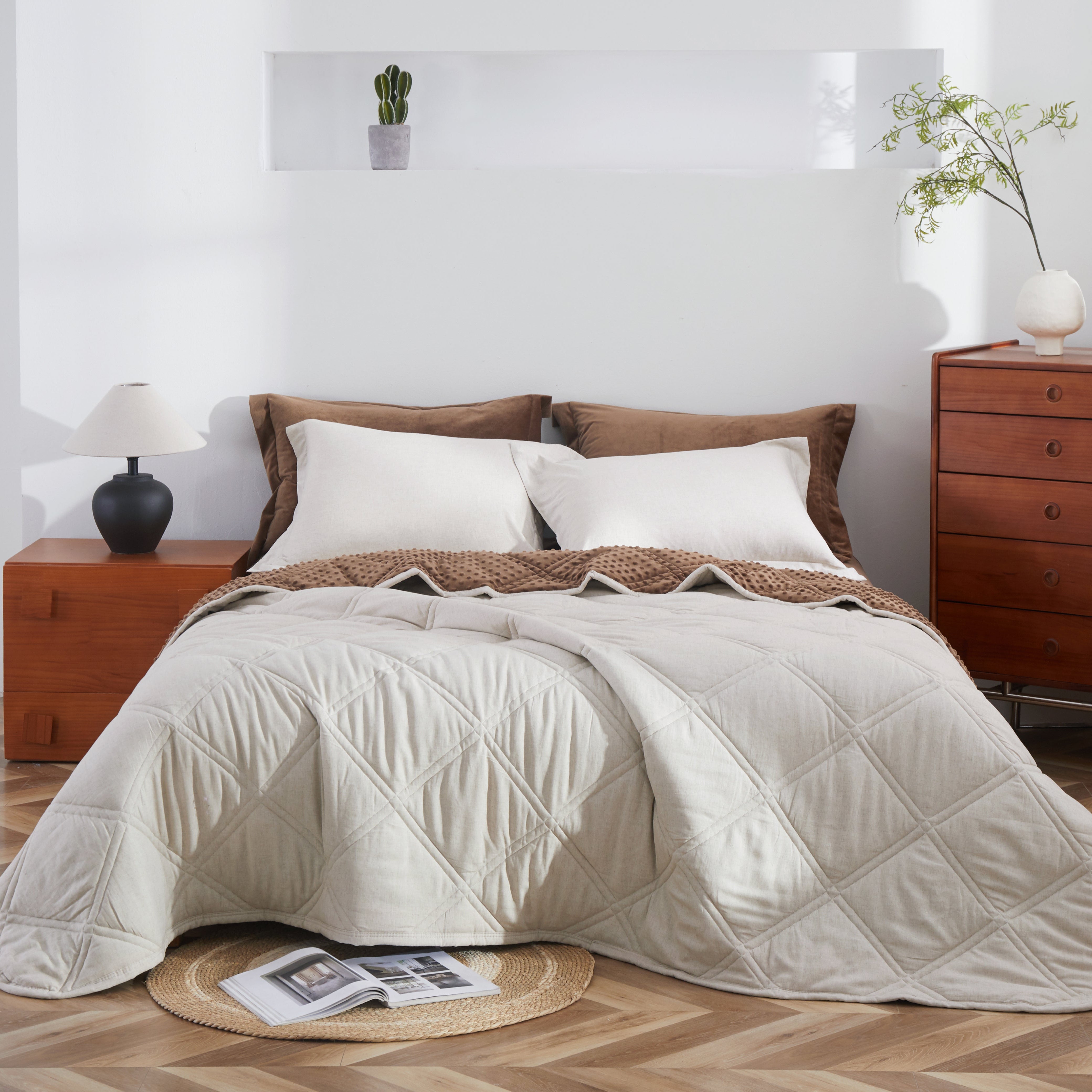
Beige, Oatmeal, and Natural Tones
Neutral earth tones create a sense of grounding and stability. These colors are psychologically associated with nature, safety, and simplicity—exactly what your brain needs after a complex, demanding day.
Beige and oatmeal tones work particularly well in Canadian homes where natural light varies dramatically between seasons. These colors remain warm and inviting even on the darkest winter mornings, while not absorbing too much light during summer evenings.
The beauty of neutrals lies in their versatility. They create a calm baseline that allows you to add personality through accent pieces without overwhelming your senses as you're trying to wind down.

White and Off-White
Pure white bedding signals cleanliness and simplicity. It creates a hotel-like sense of luxury and freshness that many people find psychologically soothing. White also maximizes light reflection, which can make smaller bedrooms feel more spacious and open.
However, stark white can feel cold or clinical to some people. Natural white—slightly warmed with cream or ivory undertones—provides the psychological benefits of white while maintaining warmth and comfort.
Sophisticated Depth with Darker Tones
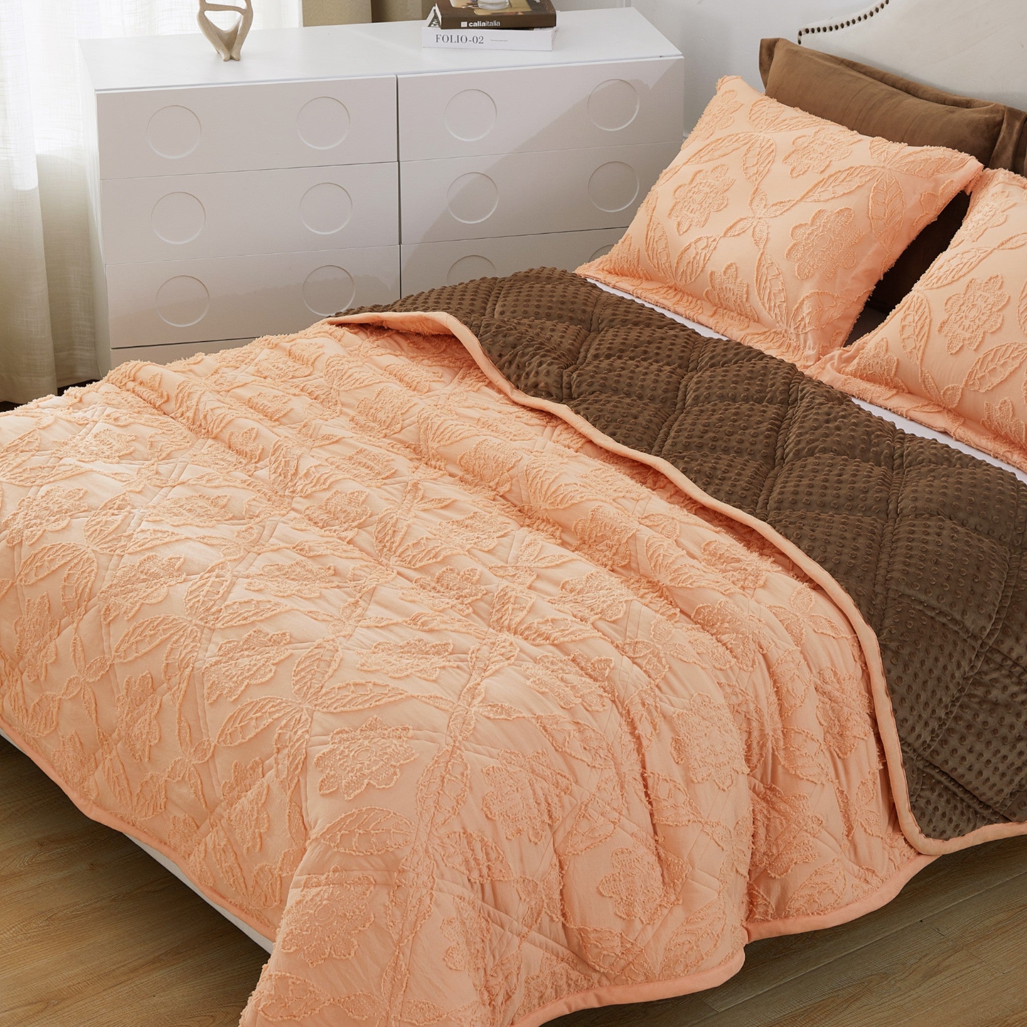
Mocha and Deep Browns
Rich brown tones create a cocooning effect that many people find deeply comforting. Psychologically, browns are associated with stability, reliability, and natural warmth. They create an enveloping sense of security that facilitates the vulnerability required for deep sleep.
Mocha tones work beautifully in bedrooms with good natural light, creating depth without feeling heavy. They're particularly effective for people who find lighter colors too stimulating or who prefer a more intimate, enclosed feeling in their sleep environment.
Turbulence and Cool Greys
Modern grey tones like "Turbulence" provide sophisticated calm without the starkness of white or the heaviness of darker browns. Cool greys are psychologically neutral—they don't overstimulate or depress mood, making them ideal for people who are particularly sensitive to color psychology.
Grey bedding creates a contemporary, uncluttered aesthetic that appeals to minimalist sensibilities. It pairs well with virtually any bedroom color scheme while maintaining a sense of serene simplicity.
The Strategic Use of Color Accents
Two-Tone Designs and Color Blocking
Color-blocked bedding allows you to incorporate color psychology strategically. A neutral base with a colored accent provides visual interest without overwhelming your space with bold hues.
The combination of two complementary tones creates subtle visual rhythm that's interesting enough to be aesthetically pleasing but calm enough not to overstimulate. This approach works particularly well for people who want personality in their bedroom without sacrificing the tranquility needed for quality sleep.
Understanding Cool vs. Warm Tones
Cool Tones for Hot Sleepers
If you naturally run warm or live in a bedroom that gets afternoon sun, cooler color tones can psychologically enhance comfort. Greys, icy blues, and cool whites create a subtle cooling effect through color association alone—your brain associates these colors with coolness, which can make you feel slightly cooler even before physical temperature factors.
Warm Tones for Cold Sleepers
Conversely, if you're always cold or your bedroom faces north and never gets direct sunlight, warmer tones like beige, oatmeal, and mocha can create psychological warmth. These colors are associated with heat, comfort, and coziness, making your space feel warmer even at the same actual temperature.
Color and Morning Mood
The colors you see when you first open your eyes affect how you feel about starting your day. Harsh, jarring colors can create a subtle sense of stress right from the moment of waking. Gentle, welcoming tones ease you into consciousness, setting a positive tone for the day ahead.
Consider what you want to feel when you wake up:
- Energized but calm: Natural whites and light neutrals
- Grounded and ready: Warm beiges and oatmeal tones
- Peaceful and unhurried: Soft greys and muted earth tones
- Cozy and comfortable: Rich mochas and warm browns
Seasonal Considerations for Canadian Bedrooms
Canadian bedrooms face unique challenges with dramatic seasonal light changes. A color that feels perfect in July might feel too cold in January, or vice versa.
All-season color choices work by balancing warm and cool undertones:
Winter months: Warmer tones help combat the psychological impact of short days and cold weather. Beige, oatmeal, and mocha maintain a sense of warmth and comfort during the long Canadian winter.
Summer months: These same warm tones remain pleasant in summer because they're not intensely saturated. They provide visual warmth without the heaviness of deep, bold colors.
Transitional seasons: Neutral tones shine during spring and fall, complementing the changing natural light without feeling seasonally inappropriate.
Creating Color Harmony in Your Bedroom
Your comforter is the largest single piece of color in your bedroom. It sets the tone for your entire space and should harmonize with your walls, curtains, and flooring.
For white or light walls: Almost any comforter color works, but darker tones create beautiful contrast and visual interest.
For colored walls: Choose bedding that either complements your wall color (colors near each other on the color wheel) or provides neutral balance (beiges, greys, whites).
For dark walls: Lighter bedding prevents the space from feeling too enclosed, while tonal darker bedding creates a sophisticated, cocoon-like environment.
The Bamboo-Linen Color Story
Natural fiber bedding in bamboo and linen blends offers unique color properties. These materials have inherent texture that adds depth to color, preventing flat or boring aesthetics even in neutral tones.
The slight natural variation in bamboo-linen fabrics creates visual interest without pattern or bold color. Light plays across the textured surface, creating subtle shadows and highlights that make neutrals feel alive and dynamic.
Personal Psychology Matters Most
While color psychology provides helpful guidelines, your personal associations and preferences matter more than any universal rule. If you have positive memories associated with a particular color, that emotional connection may outweigh general psychological principles.
Consider your reactions:
- Which colors make you feel immediately calm when you see them?
- Are there colors that make you feel energized in ways that might interfere with sleep?
- Do certain colors trigger memories or associations that affect your mood?
Trust your instincts while using color psychology as a helpful framework rather than rigid rules.
Beyond Color: The Complete Sleep Environment
Color works in concert with other bedroom elements to create your complete sleep environment. Even the perfect color choice won't overcome poor lighting, uncomfortable bedding materials, or a cluttered space.
The ideal bedroom combines:
- Psychologically appropriate colors
- Luxuriously comfortable materials
- Proper light control
- Minimal visual clutter
- Temperature regulation
When all these elements work together, you create a space that supports both the practical and psychological aspects of restorative sleep.
Making Your Choice
Choosing bedroom colors isn't about following trends or matching Instagram aesthetics. It's about creating a personal sanctuary that supports your unique sleep needs and emotional wellbeing.
Take time to consider:
- Your natural temperature tendencies
- Your sensitivity to color and visual stimulation
- Your existing bedroom aesthetics
- How you want to feel when you enter your bedroom
- What your morning mood needs from your environment
The right color choice will feel immediately right when you see it in your space. Trust that feeling, informed by an understanding of how color affects your psychology and sleep quality.
Your bedroom should be the most restful place in your life. Choosing colors that support rather than undermine that goal is one of the simplest yet most impactful changes you can make.

